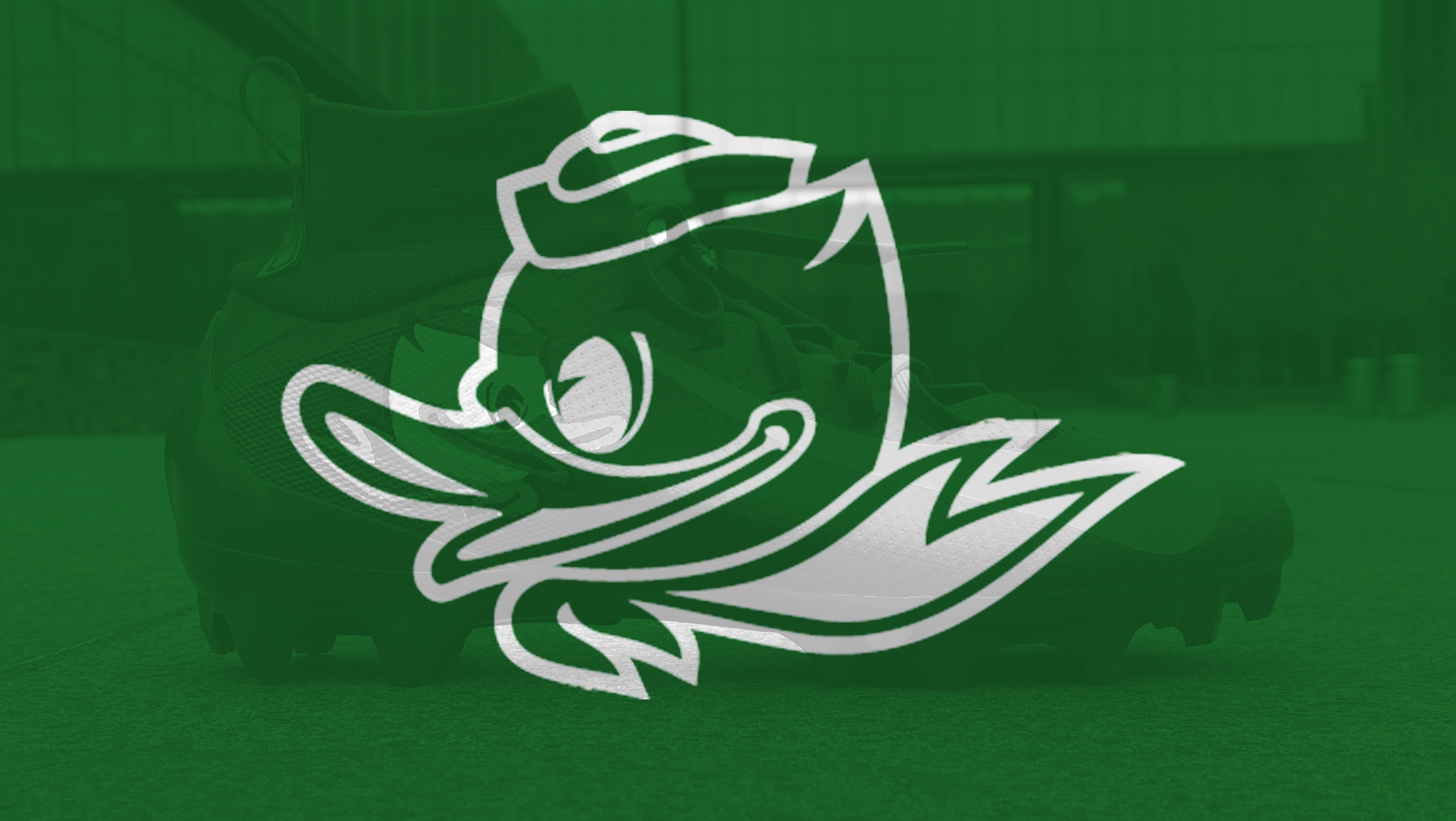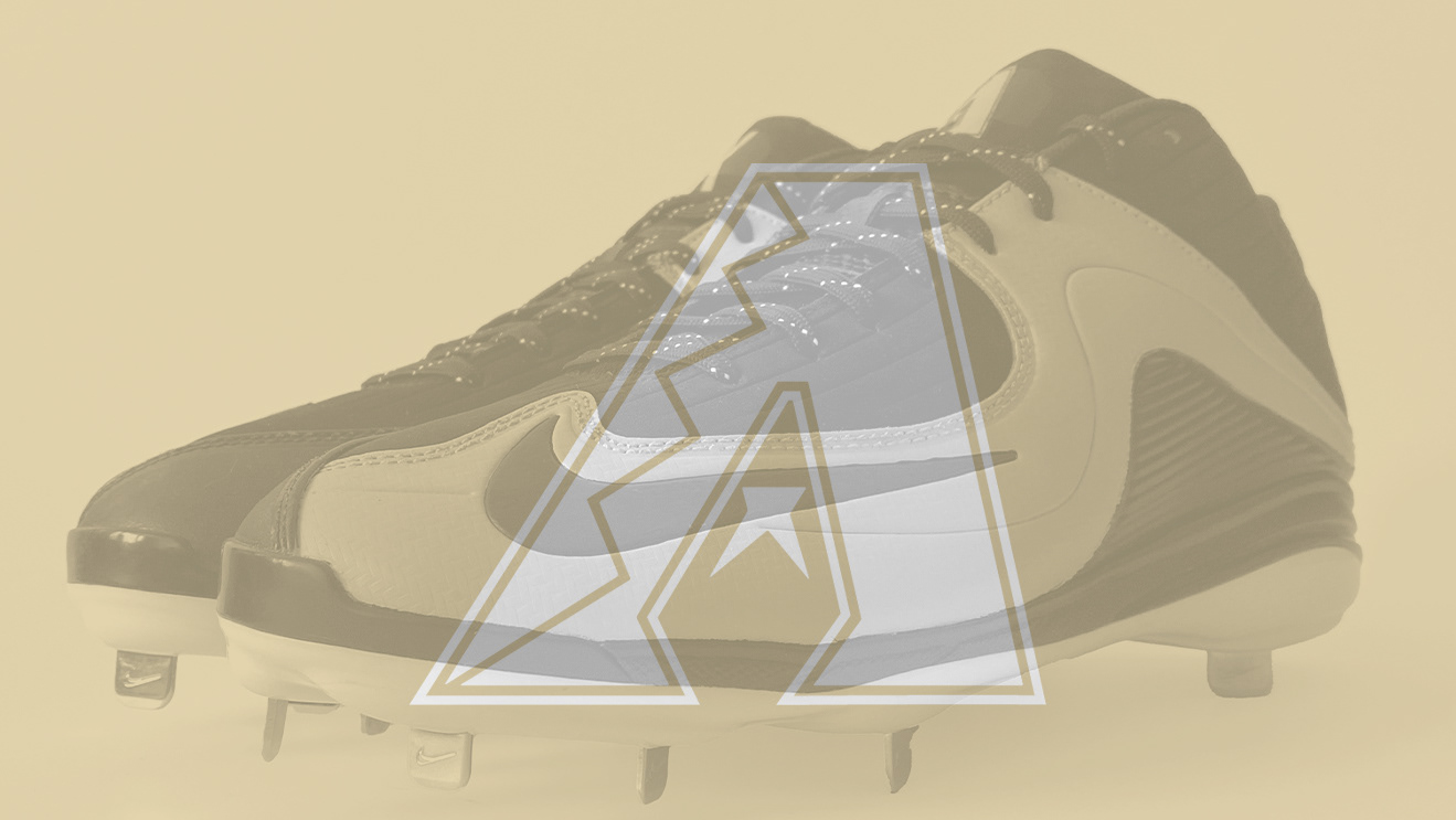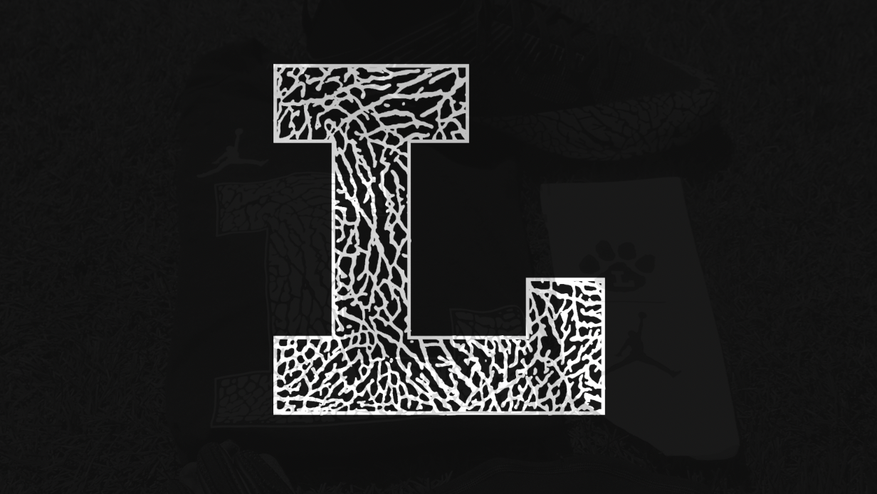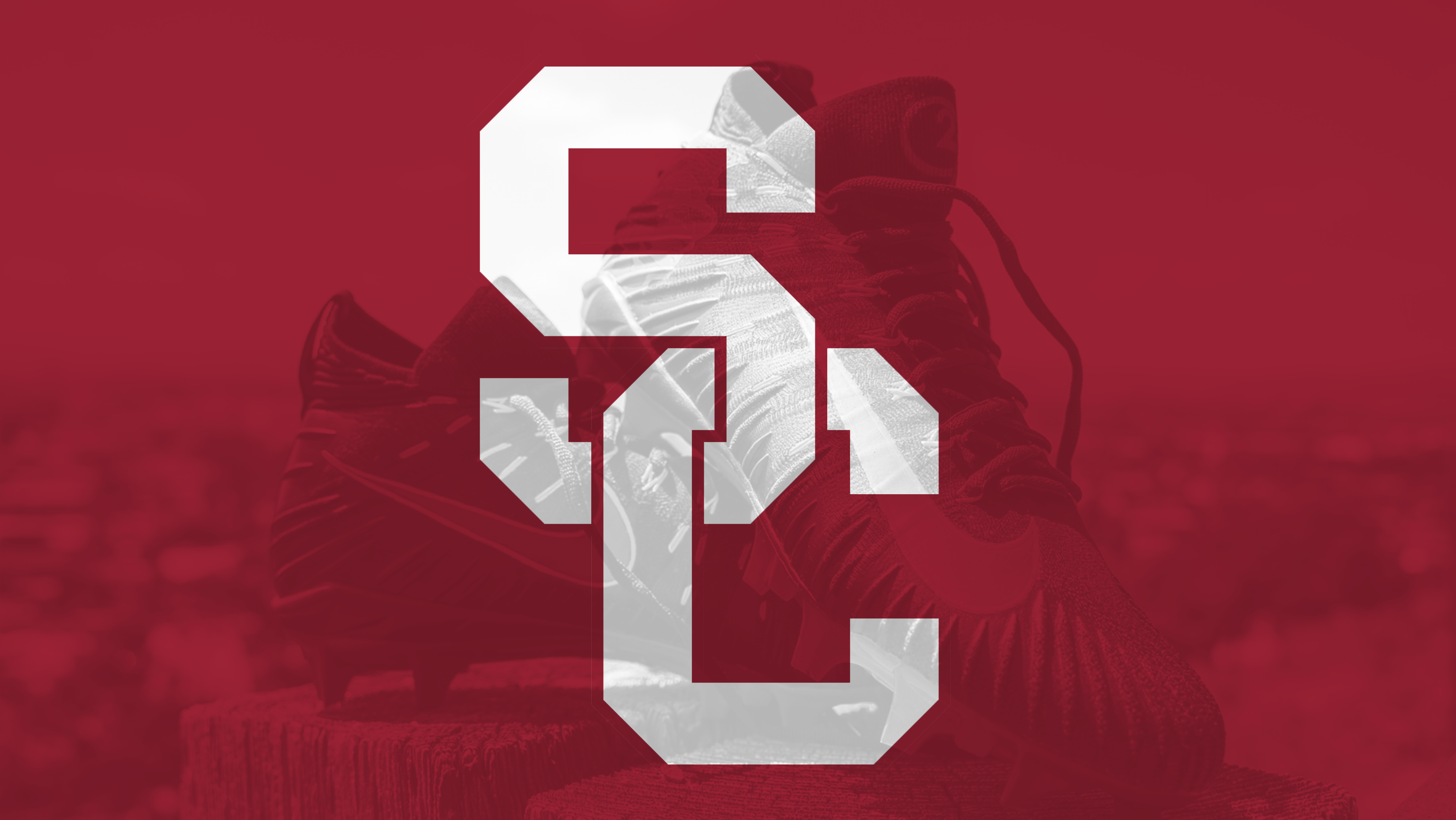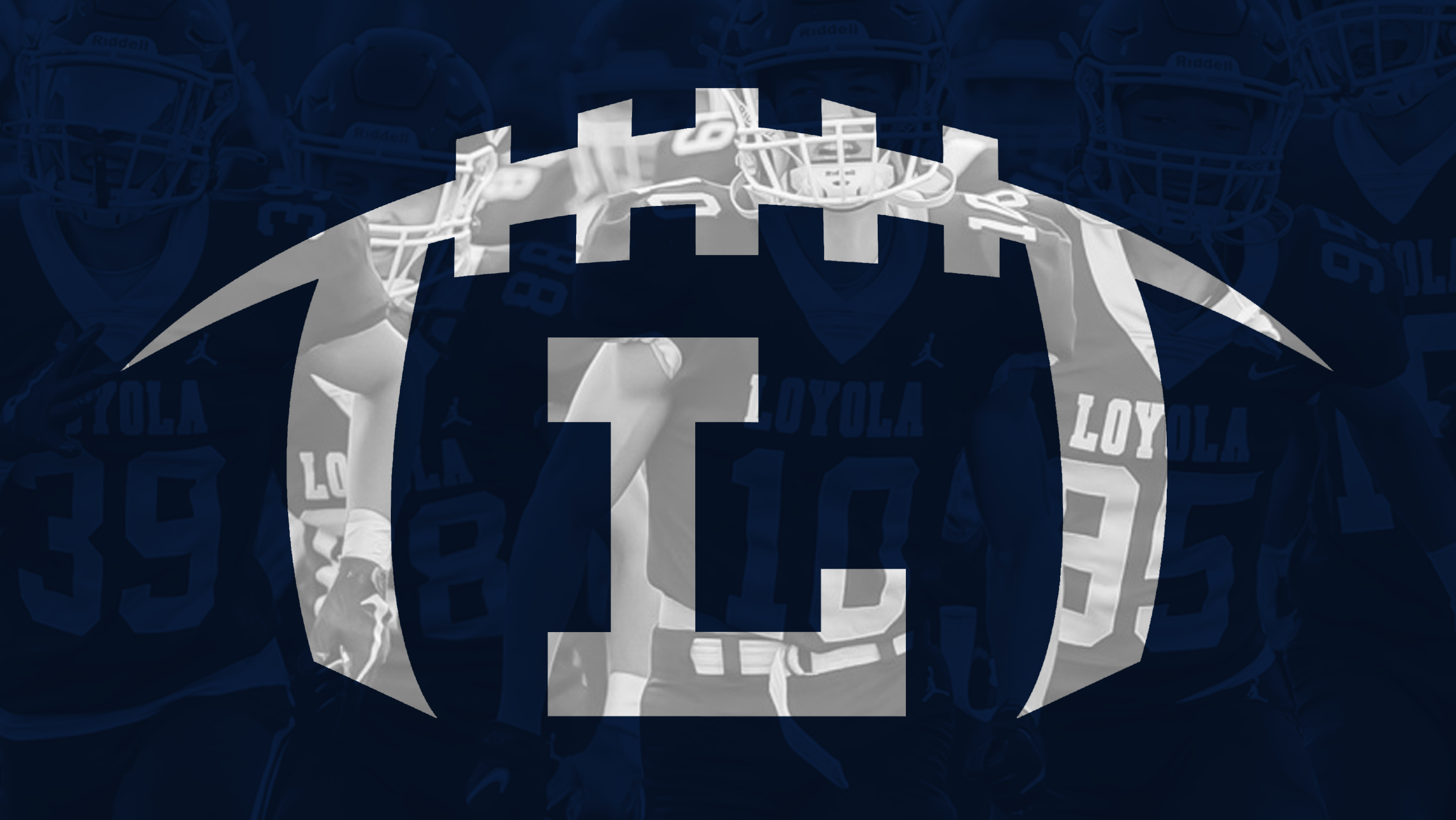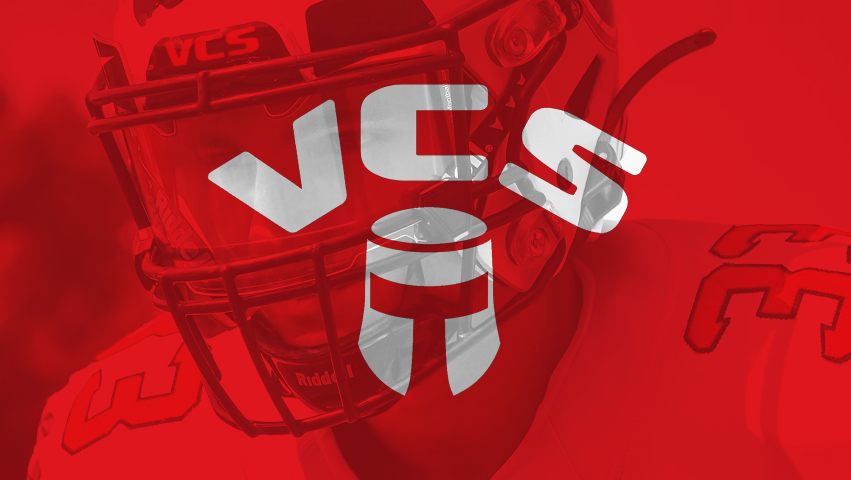
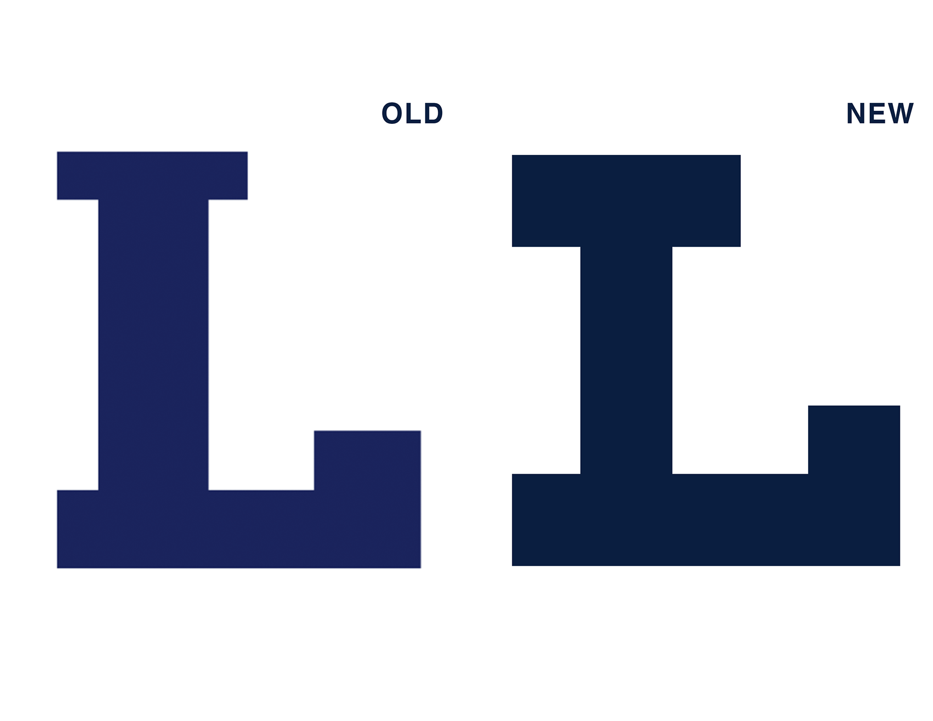
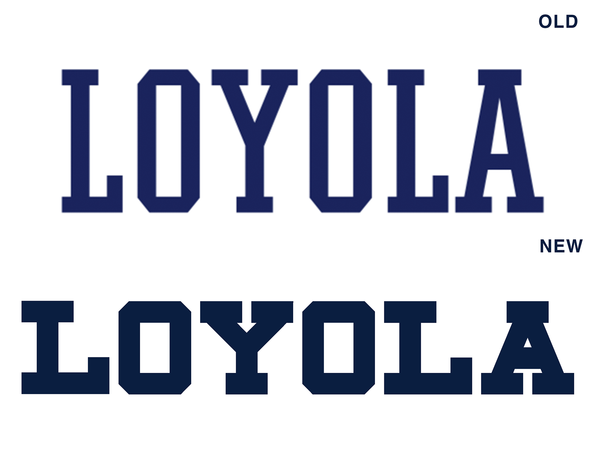
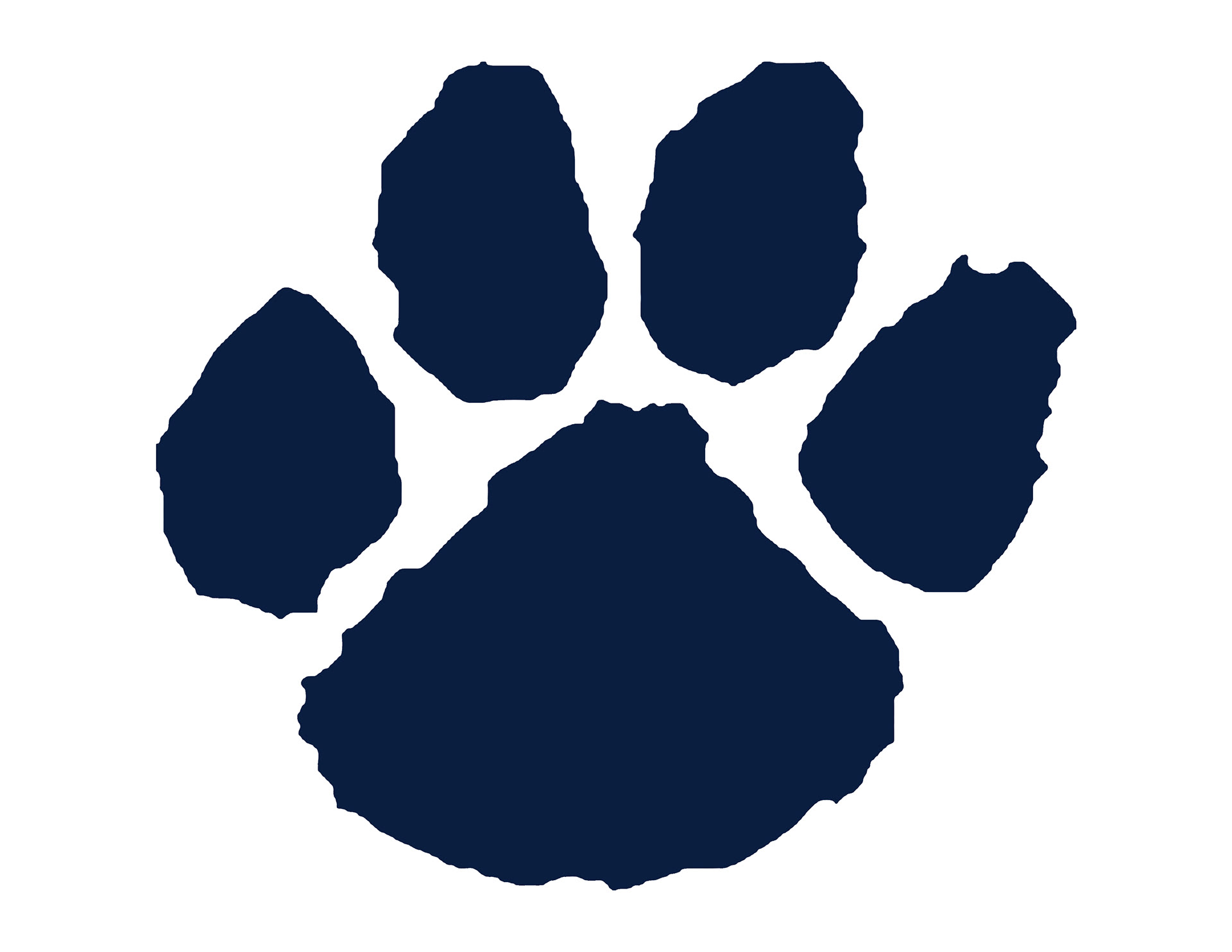
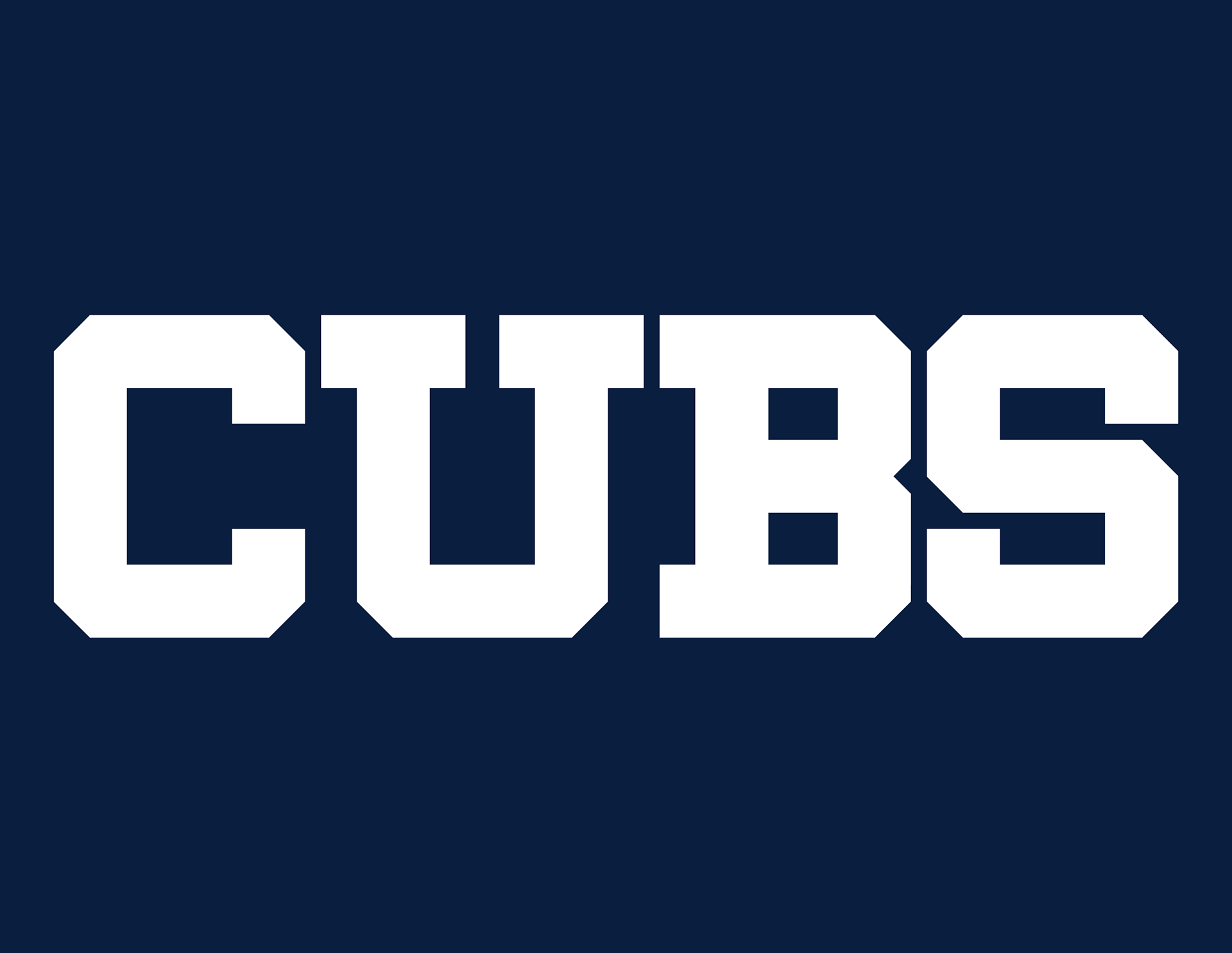
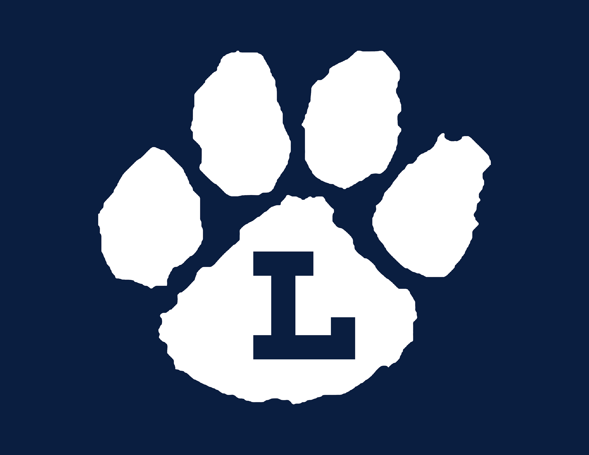
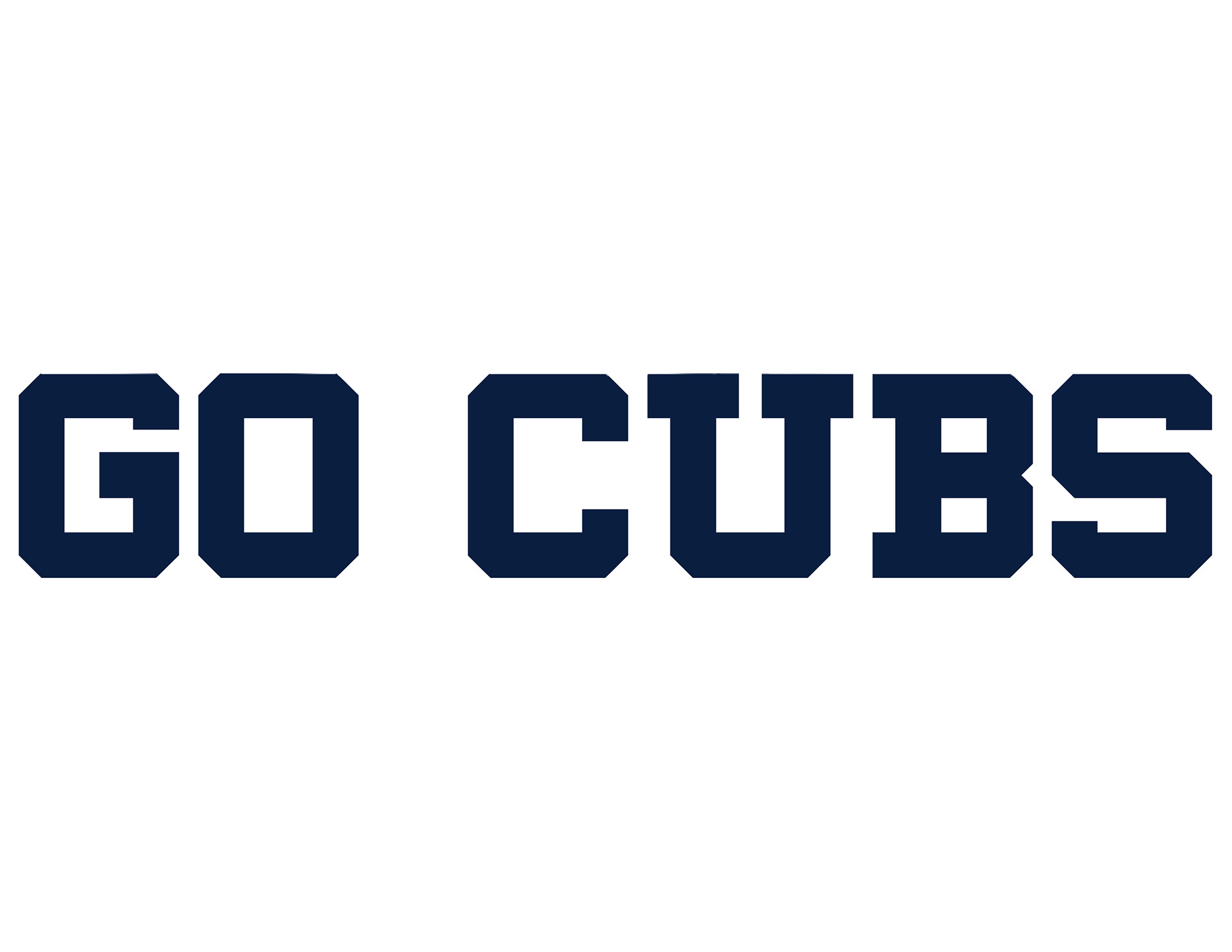
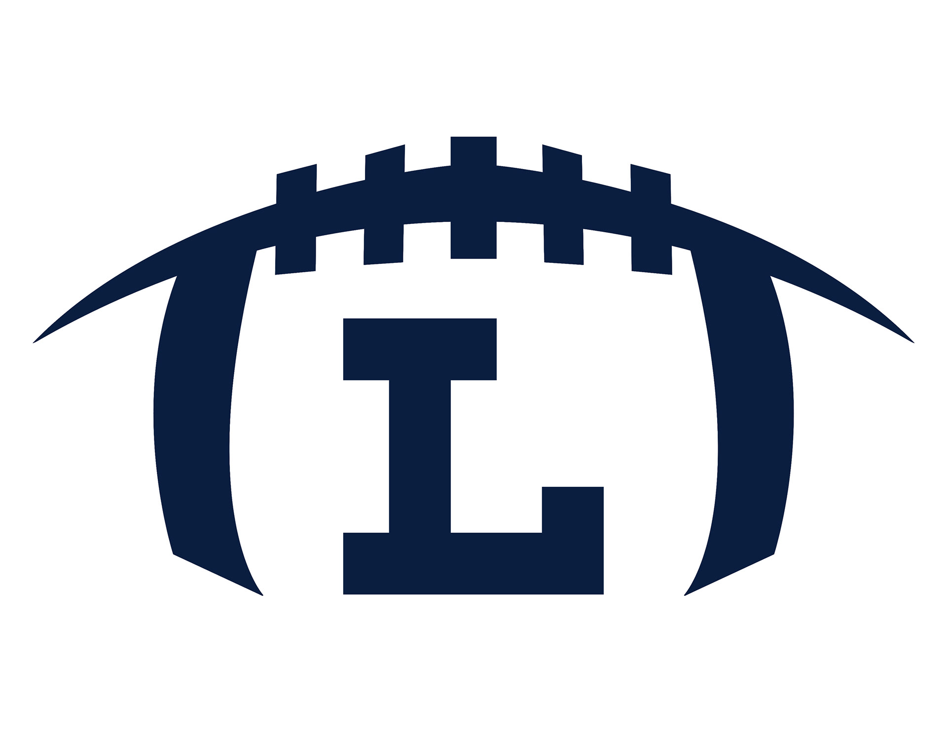
In the Summer of 2018, I was commissioned to rebrand Loyola High School Athletics. The school used a variety of colors, logos, fonts and the brand manual was weak. This caused the brand to be confused with other schools. This campaign will unite the department under one brand, create consistency, strengthen the brand, open up opportunities for partnerships, bring in future prospects, and help propel the brand into the future. Keeping true to the school's values, the brand was created for the modern age rooted in tradition. Logos such as the "Paw" remained untouched while the font is a unique block font to Loyola. The "L" is in the same font and new wordmarks such as "Go Cubs" have been added. A new pattern representing the primary material found throughout campus was another new element added into the rotation. Football and baseball will continue to have their own primary logos, but the rest of their identities will be in line with the new standards.
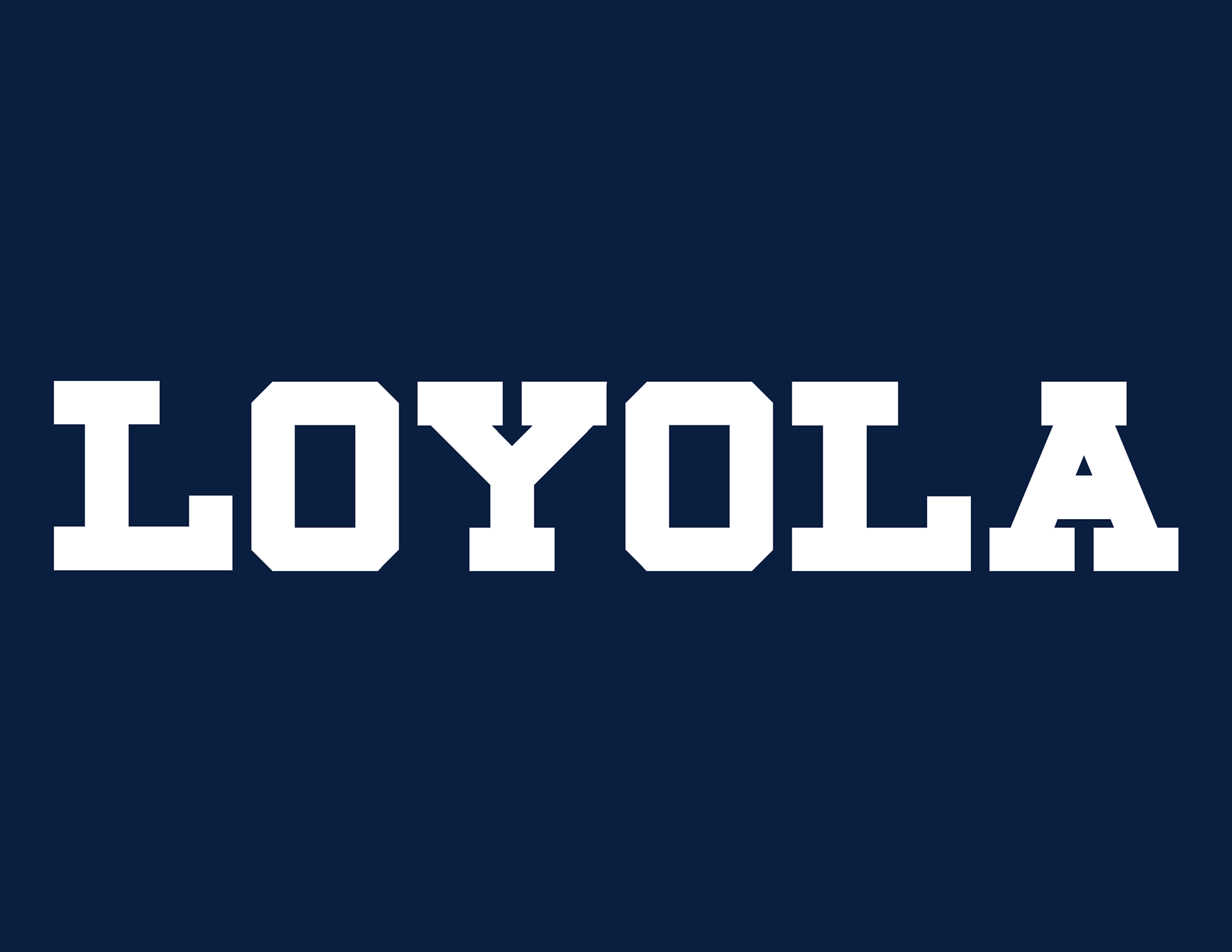


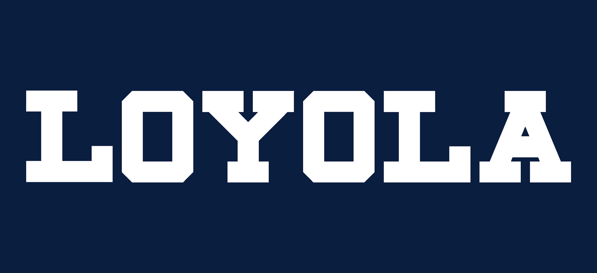
Custom Font

Color Codes

Baseball Logo

Brick Pattern
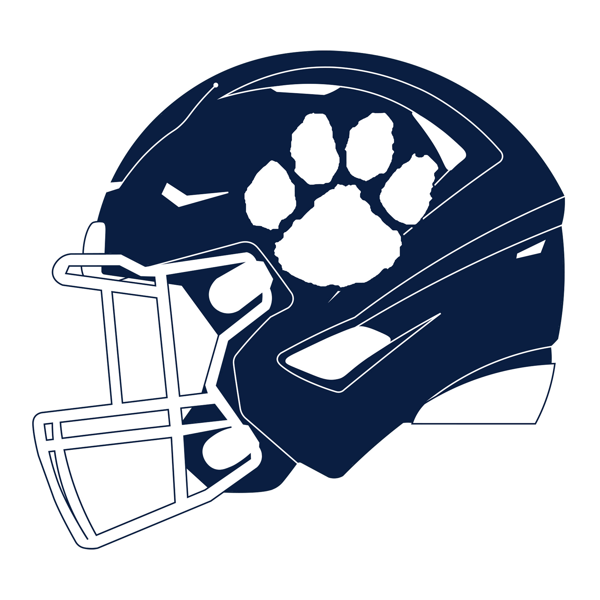
Football Helmet Logo
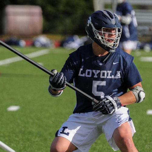
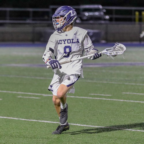
Below are a examples of how the new brand identity has been applied to the updated lacrosse and soccer uniforms.


All logos and images were created for Loyola High School Athletics.